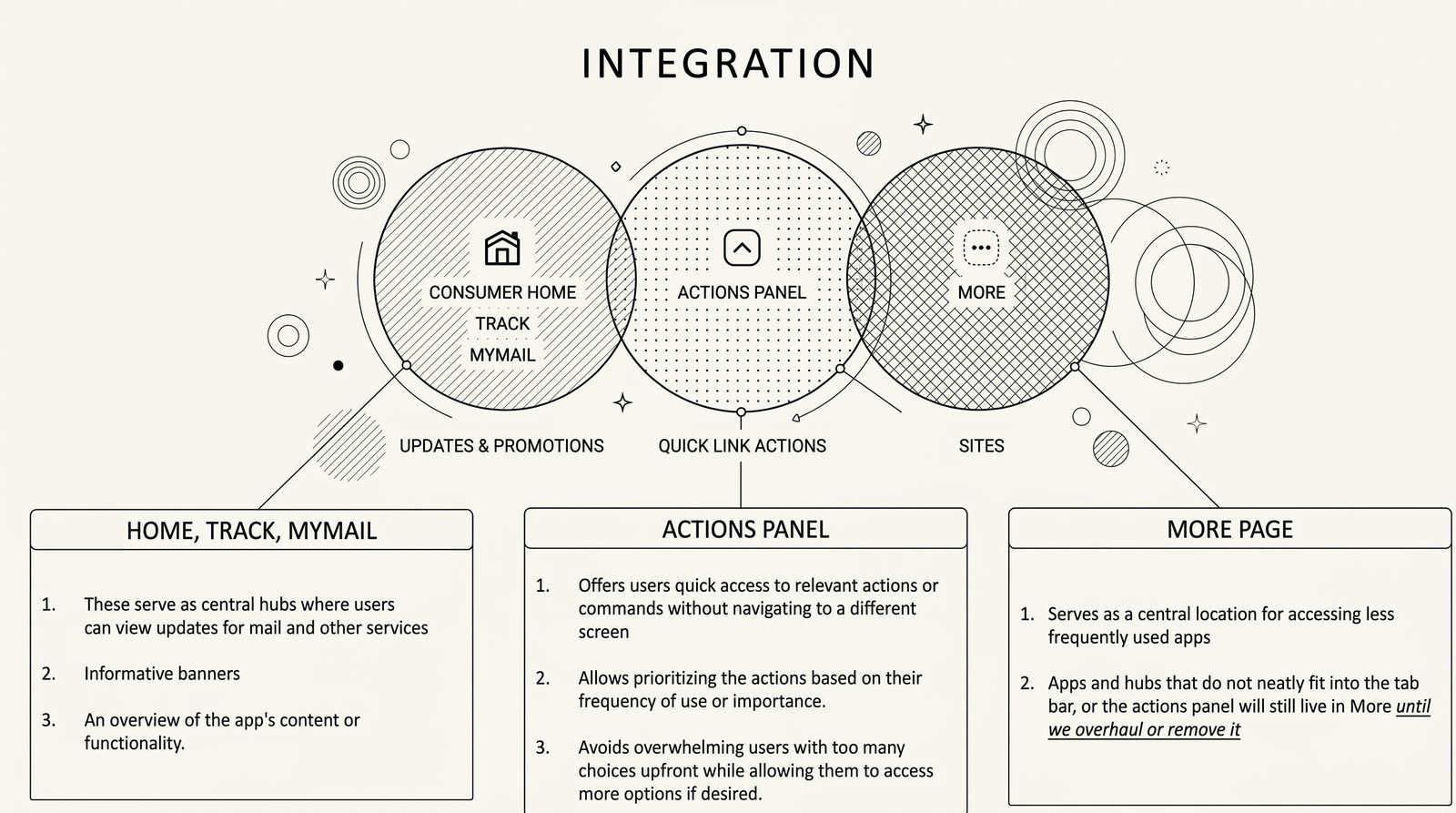
Canada Post: Unifying the Mobile Ecosystem.

Transforming a fragmented user journey into a cohesive, 5-star digital experience for millions of Canadians.

Role
UX Design Manager Mobile UX Team
Platform
iOS & Android
Timeline
2023 — 2025 Vision
Outcome
+0.6★ store rating

I led the Mobile UX team to overhaul the Canada Post digital experience. By aligning competing roadmaps across a massive enterprise, we transitioned a confusing, inconsistent mobile application into a unified, future-proof platform.

Canada Post mobile UX team — illustration of designer holding a phone in a Canada Post office
Strategy & Leadership

Orchestrating Enterprise Alignment.

01 — Alignment

This initiative required maneuvering through a highly complex corporate structure. I managed the collaboration of dozens of Product Owners, fellow UX Managers, Designers, Developers, and executive stakeholders. The ultimate challenge — and triumph — was harmonizing competing roadmaps and distinct departmental visions into a single, cohesive 3-year digital consumer vision.

02 — Evidence

We refused to rely on assumptions. My team conducted rigorous qualitative and quantitative UX research to pinpoint exactly where users were abandoning flows. We iteratively validated our proposed navigation models with real users, ensuring every decision was backed by data.

The mandate wasn't to design a prettier app — it was to harmonize a decade of competing institutional decisions into a single experience users could trust.
— Field notes, Q2 planning offsite
The Challenge

The Friction Points.

The legacy mobile apps suffered from severe inconsistencies across iOS and Android — users navigated a maze of unclear patterns, disjointed components, and buried menus. We isolated three concrete frictions that the design system had to resolve.

01

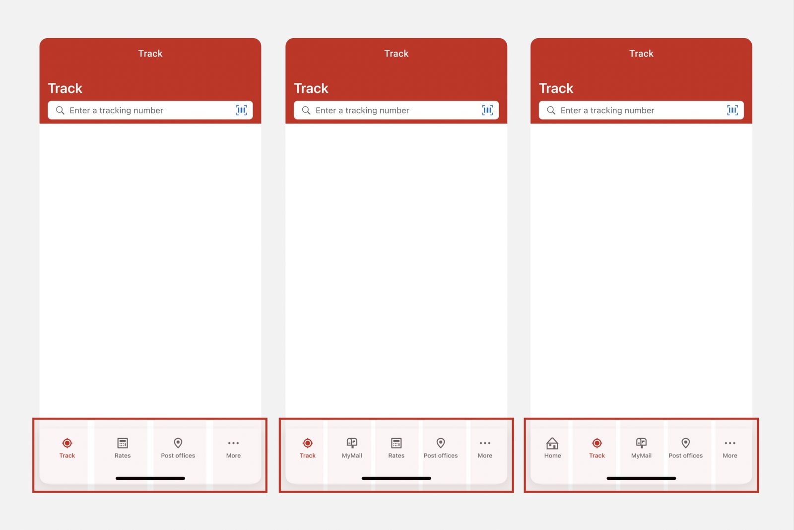
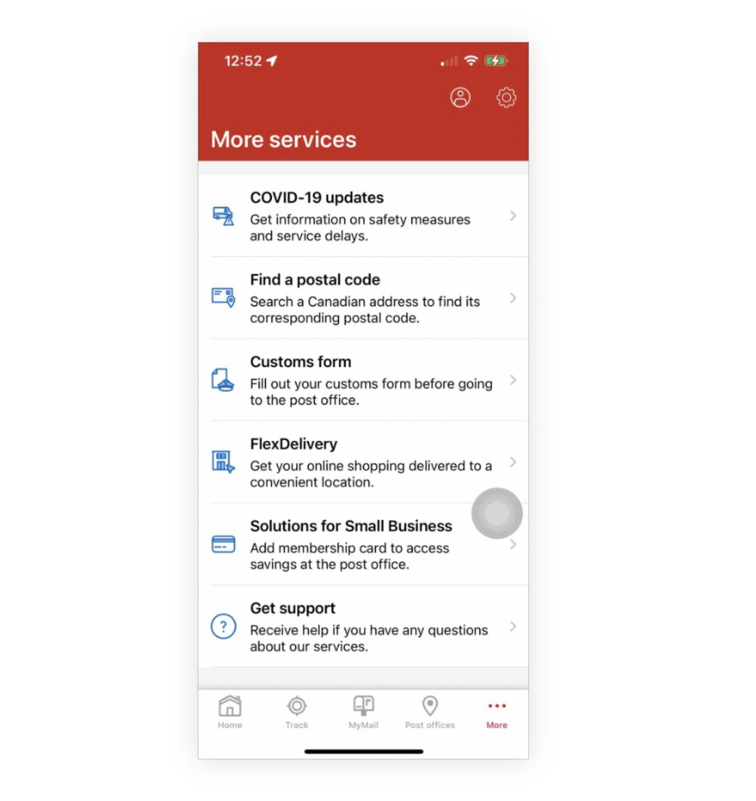
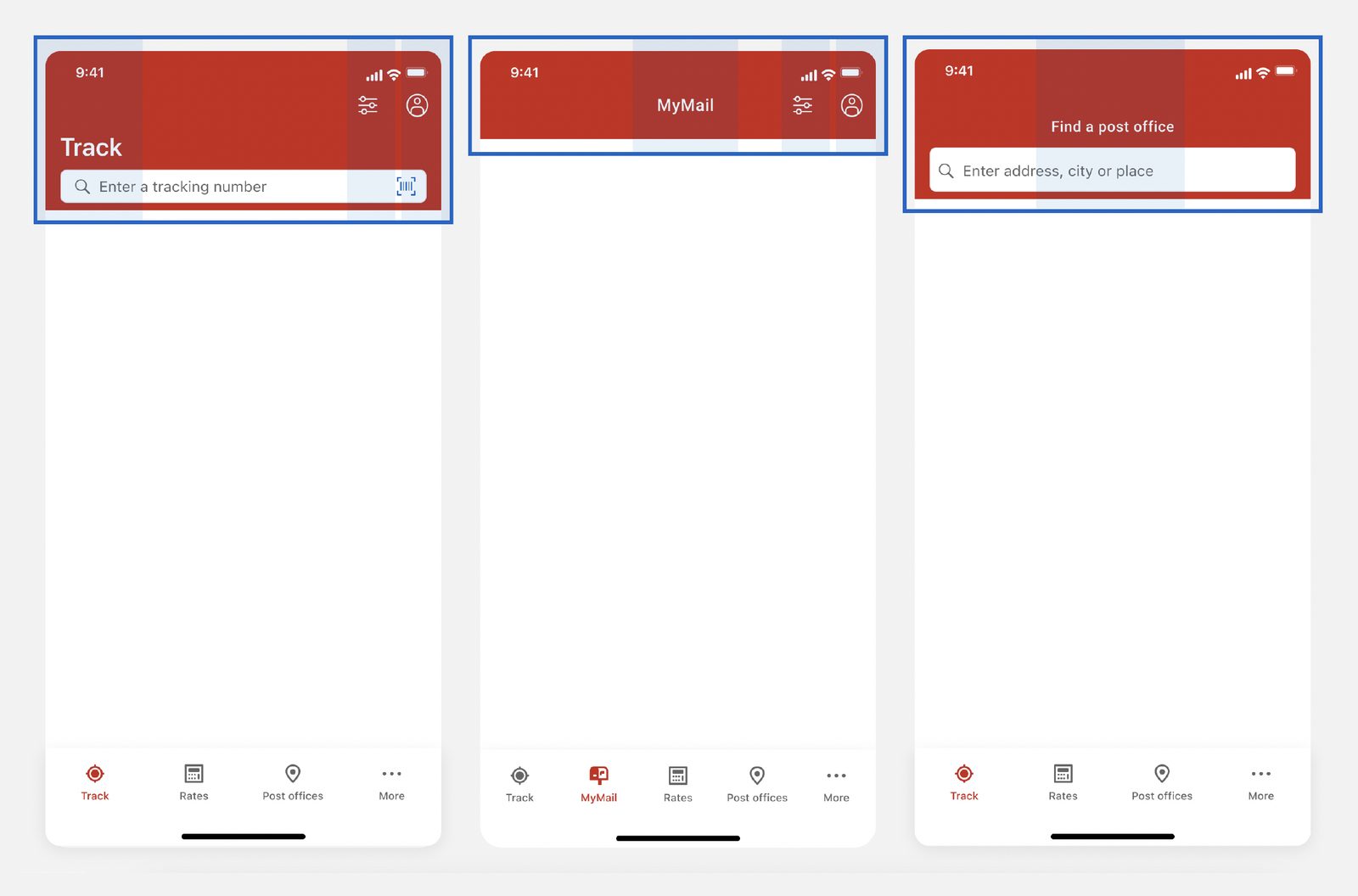
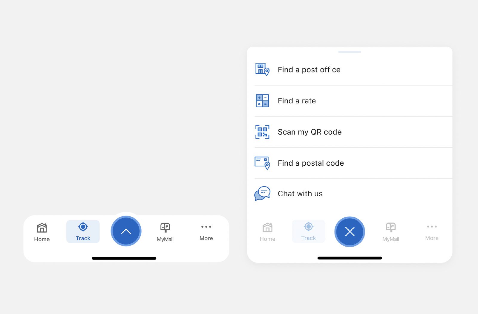
Navigation that couldn't scale for future services.

Planned services over the next 2 years required changes to navigation that the existing structure simply couldn't carry — visibility was too shallow and too rigid.

  • CORE features need to be easily accessed.
  • NEW features need to be discoverable.
  • Within the application today, there are few options to enable this.
Three Track screens showing navigation evolving from a 4-tab bar to a 5-tab bar — illustrating limited visibility for new services
More services page listing COVID-19 updates, Find a postal code, Customs form, FlexDelivery, Solutions for Small Business, and Get support in a flat list
02

"More services" with no organization.

This page offered no organization or scalability for discovery or ease of access — anything that didn't fit elsewhere ended up in a long, undifferentiated stack.

  • Core features become buried.
  • Access to features used repeatedly becomes tedious.
  • New features are hidden if they end up here.
03

Inconsistent app bar across different flows.

The action app bar should serve as a consistent, easily-accessible location for common actions and controls. Today, placement, size, and appearance of buttons, icons and other elements all drift screen-to-screen.

Consistency in this layout is how users recognize and trust familiar controls.

Three Canada Post screens — Track, MyMail, Find a post office — each with a differently-laid-out red top action bar
The Approach

Three shifts toward a unified platform.

We translated the friction points into concrete design moves — each anchored in a shared component vocabulary and rolled out incrementally across iOS and Android.

01

Introduce an "actions panel."

What is it?

A UX element at the bottom of the screen that surfaces a set of actionable options — letting users perform context-specific actions without leaving their current page.

Why?
  • Quick, convenient access to common actions on any page.
  • Visible and accessible — new features land where users actually look.
  • Actions can be re-prioritized by frequency or importance.
  • Progressive disclosure: condensed by default, expandable when needed.
Introduction of the actions panel — collapsed tab bar with a central elevated action button (left), and the expanded panel revealing Find a post office, Find a rate, Scan my QR code, Find a postal code, Chat with us (right)
Integration diagram showing how the Actions Panel relates to Consumer Home/Track/MyMail and the More page
Integration model — how the Actions Panel sits between the consumer hubs and the More page.
02

Revamp the top action bar.

Established new design patterns and conventions for the placement and behavior of the top action bar across all Canada Post apps. Users carry strong expectations into mobile experiences — consistency here is what makes the rest feel familiar.

Why?
  • Better consistency so users learn what to expect on each page.
  • Provides a clear label for pages, keeping users oriented.
  • Persistent top-level access to important features (e.g. account, top-left).
  • A familiar area to surface contextual actions (add tracking number, scan label, top-right).
Three unified red top action bars — Track (with profile, scan, plus actions), MyMail (with profile, settings), and Find a Post Office (with profile, search)
03

Add detailed tracking events.

Quantifying the Mobile Experience

Incorporating more tracking events into mobile-app navigation lets the team gather concrete data and insights about how users actually move through the apps.

With more events in place, we could understand behavior, identify pain points, and make data-driven decisions to refine priority and hierarchy across components and quick links.

04

Risk Mitigation

Evidence-Based Validation

At a national scale, assumptions are costly. I partnered closely with the UX Research team to validate our proposed navigation models with real users before writing a single line of code. By evaluating quantitative performance and capturing nuanced user behaviors, we transformed subjective design debates into an evidence-based roadmap — mitigating rollout risk and ensuring seamless adoption.

Rollout

Strategic phase rollout: unifying the mobile ecosystem.

Shipped incrementally from Q1 2023 through a 2024+ vision — every release built on the last, so users could absorb each change while we gathered concrete data, monitored adoption, and mitigated implementation risk.

Rollout timeline — Q1 2023 iOS release (Core Nav Updates & Action Panel), Q2 2023 iOS (Advanced Tracking Events), Q3/Q4 2023 Android (Shipment Details Updates), 2024+ vision Android release (Onboarding, Today Screen, and Native Compliance)
The Impact

Measurable Success.

iOS App Store rating
4.0
4.6
+0.6 post-launch, sustained over 4 quarters
Android Google Play rating
4.1
4.7
+0.6 consistent across both platforms

By replacing confusion with clarity, user satisfaction skyrocketed while seamlessly paving the way for Canada Post's next generation of digital services.